Planning Steps
pageSUMMARY
Designing and building a successful website always starts with solid, thoughtful planning. Consider all the elements that'll appear on a page before beginning site construction.
Developing Website Visuals
Prepare for a home page, a category page... and plan all the content
As you might have noticed, apart from our foray into Illustrator to smarten up the site map, we haven’t gone near a computer yet. This is good. A huge mistake for any designer to make, whether they be web or graphic, is to start working on a computer straight away.
Start with a blank piece of paper
The computer is a tool - nothing more - it’ll only do what you tell it to do; it won’t design for you. So you need to be prepared before diving in. I think we’re all probably guilty at one time or another of ‘doing a bit of premature computer’ - I know I am. When I have no real plan - just a vague notion in my mind’s eye - the resulting design takes five times longer to create, and it's not as fully rounded as if I’d spent an hour or so with a pencil and pad creating a basic theme and structure. It’s much easy to work from pre-designed guidelines than it is from a loose idea in your head.
Considering layout as well as look
And it’s not just about drawing a potential framework for the website itself - we have to consider all the potential ‘widgets’, info panels, forms and other bits and bobs that creep into a design once construction in under way. These are few ‘top of my head’ things to consider:
- Will the site be based on a one, two or three column grid? Or a mixture of grids?
- What elements will go into each column and why?
- What happens when you have a page which only has enough content to fill a single column?
- If you use space-fillers, will they be relevant and practical? Or an abstract white space filler?
- What about images? Will there be consistency across every page (with same-size pics in predictable locations), or will images only appear where necessary?
- Will there be a second tier of navigation to support the main menu? If so, how will it work?
- If you have any side boxes for notes or contact details, what will they look like?
- Where will they appear and why?
As with the site map, the design is bound to evolve as you proceed with the site build - but you have to invest some time in developing a solid starting point - otherwise a mess will ensue.
relevantLINKS
Reference
Macmillan NAIO Project
Ultimate Book of Science Project
More reading on layout
The Grid System (Website)
From a graphic designer’s point of view, the closest thing I can compare a website design to is an educational book design. I’ve worked for years with publishers designing and laying out book series for the educational market. One thing that every series has in common is that the initial design visuals had to take account of a whole bucket full of design devices, font styles, A-headings, B-headings, info panels, acknowledgement styles, footnote features and so on and so forth (figure 1a & 1b). The principles of hierarchy and formatting are not far removed from web design - it's just the restrictions of layout that force changes in presentation.
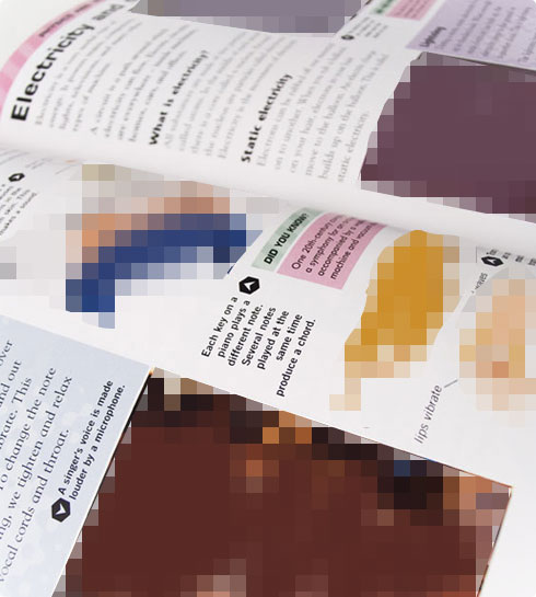
figure 1a - spread from The Ultimate Book of Knowledge, Oxford University Press
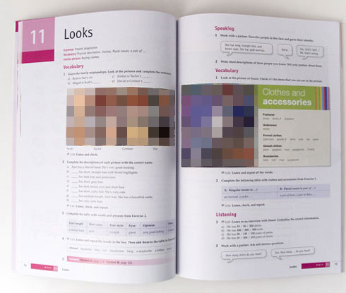
figure 1b - spread from New American Inside Out, Macmillan
footNOTE
I remember listening to a Podcast by Stephen Fry about his first Photoshop experience. Stephen was very excited about it - at last he’d be able to create marvellous things on his Mac using the revolutionary new software. Except… he didn’t. Instead, he very quickly discovered that owning Photoshop didn’t suddenly endow him with a great artistic talent - it just sat there and did what he told it to do. Which wasn't much.
I’ve had similar experiences with 3D modelling and animation software. Convinced I’d beat Nick Park to the next animation Oscar, I threw myself into 3D Studio Max. But then realised that I didn’t know how to make very good 3D models - or animate them very well.
Nick beat me to the Oscar the following year.
So website design is extremely similar. Every eventuality has to be accounted for if a measure of consistency and professionalism is to be maintained. And if done correctly, the result will be nicely designed, simple to follow and therefore effortless to use. If any element is forgotten in the planning stage, it invariably gets shoehorned in as a last minute addition - and it looks out of place as a result.
Looking at my site ‘scamps’ (figure 2), my plan was to create a three-column design with an horizontal menu bar running below the main header. The left column would have a list of hyperlinks that would act as a subcategory menu, drilling down into the main categories. The central column would have the text and images, and the right column would be reserved for info boxes which would act as informative tips, ‘side notes’ and related links to the main content. Instead of piling up the info boxes in the right column, one on top of another, it makes more sense to have the side notes only appear next to the text to which they relate.
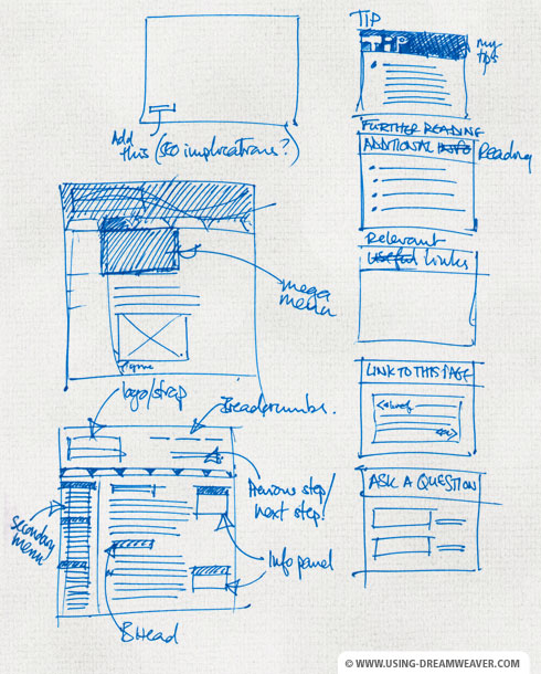
figure 2 - initial 'scamp'
Fixed Width or Expandable?
I generally prefer websites to be fixed-width rather than ‘fluid’, or expandable (unless practicality demands a fluid layout). The main reason for this is that a fixed-width page gives me more control over the design and layout. There’s nothing worse than a page full of text expanding in a single measure all the way across a widescreen display. I’d much rather have a sensible width with margins either side - and that’s how this site has been created.
relevantLINKS
W3Schools Current Statistics:
Most commonly used browser resolutions
Design to the Lowest Common Denominator
The website will be optimized for PCs running Internet Explorer on a 1024 pixel x 768 pixel display. This is because (at the time of writing*) the most commonly used browsers on the Internet are Internet Explorer and Firefox, on screen resolutions of 1024 x 768 or above.
* footNOTE
Needless to say, by the time this site goes live the most commonly used display resolution will have increased in size - but this site should still sit comfortably within it without being dwarfed by margins.
The most commonly used operating system was (at the time of writing...) Windows XP - so when I build a site, I have a PC laptop next to me running Windows XP, IE8 and Firefox (as well as Safari and Chrome) so I know the site’s going to work for as many people as possible. On the Mac I test it on Safari, Firefox and Opera. I also have a very old, tired PC running XP and IE6 so I don't ignore the 3% of IE6 users... but I won't be doing this much longer.
Once I feel I’ve gone as far as I can with my thumbnails and site sketches, I move to Photoshop. Of course, you may prefer Gimp or Fireworks - the principals of design and layout are the same no matter what tools you choose.
And so on with the design…
Designing Website Visuals - End of Article
Go to previous article | Go to Home Page | Go to next article
Feedback required!
Please send any questions or feedback to: feedback@using-dreamweaver.com or leave it on our Facebook page.