Building Steps
- Set up a Site
- Create a Template
- Create a CSS File
- Link to a CSS File
- HTML Basics
- Set Page Margins & Background
- Create Site Structure
- Create a Three Column Layout
- Style Headings and Paragraph Tags
- Style Website Links
- Create Breadcrumb Links
- Style Round Cornered DIVs #01
- Style Round Cornered DIVs #02
- Create Navigation Tabs
- Adding a Footer
- Create Editable Regions
- Name the Categories
- Create a Page from the Template
- Create a Library Item
- Creating More Pages
pageSUMMARY
Slice up a Photoshop file precisely to extract the rounded corners which will be used as background images applied to H3 tags and an OL tag.
Create Round Cornered DIV Tags
Create rounded corners on boxes by using background images method#1
Now that the framework and look of the site template is coming together, it’s time to get to grips with the round-cornered box, created using a single DIV tag. I used to create these (and most everything else) using tables.
relevantLINK
CSS3, please!
CSS3 is definitely the way things are heading, and you can create plently of effects already (like drop shadows and object rotation) that work across all browsers. If you'd rather create rounded corners using CSS3 and have them degrade gracefully to hard corners in IE6, 7 and 8, this is the site for you.
When I forsook tables for DIV tags, my first assumption was that I would need four DIVs to create the effect - one for the container, one for the top corners, one for the main content and the last for the bottom corners. As it turned out however, all I needed was a single DIV. Although rounded corners on DIVs can be created simply using CSS3, widely-used browsers like Internet Explorer (surprise!) versions 6, 7 and 8 don't support them. So if you want to create a single style sheet that works universally, you'll need to use background images.
Three slightly different ways to round the corners using background images
On our site there are three types of round cornered panels using a single DIV, and all three are created slightly differently in order to accommodate the requirements of their content. The menu tabs need just the two top corners to be rounded, but the width of the tabs need to be variable. The left column panels are fixed width, contain a variable number of headings (depending on which page is being viewed) and require bottom rounded corners as well as top. Finally, the top panels on the right (whilst also fixed width with four rounded corners) only have a single heading. All three are styled slightly differently as follows.
Round Cornered Div #1
Starting with the left column box (currently colored red), here’s a basic description of how it’s done:
The DIV tag has a tiled background image, which repeats vertically, supplying a flexible vertical border for the sides. The H3 tag at the top of the panel (it will be essential for there to be an H3 heading at the top for this to work) has a class style attached to it that includes a non-repeating background image showing two rounded top corners. Within the panel, the links are styled as lists, all of which are <OL> (ordered lists). We’ve added a ‘class’ style to the last <OL> list block to display a non-repeating background image of the bottom-rounded corners whenever it appears in this panel.
And that’s all there is to it... Now for the step-by-step procedure:
Prepare the background tile and rounded corner images
Open your original Photoshop layered site visual, turn off any text layers which display content in the left column panel and flatten the image (remembering not to overwrite the original by mistake). Crop in precisely on the left panel (figure 1).
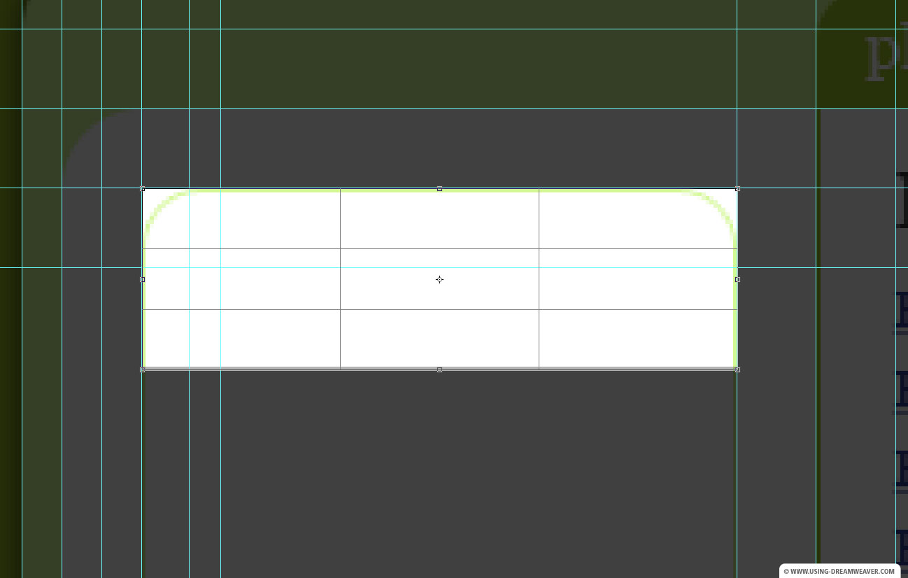
Figure 1 - Crop tight to the tab image
Note that we’re not concerned about cropping to the bottom of the panel because we’re simply going to flip the top cornered pane vertically and save it as the bottom of the panel. Duplicate the resulting flattened image.
On one of the documents, use the rectangular marquee tool to select the top of the document. Select the full width of the image and as far down as you need to go (14 pixels in my case) in order to clear the anti-aliasing at the bottom of the curved edges (figure 2).
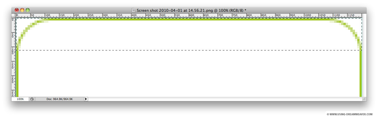
Figure 2
Now crop the image. Go to:
File/Save for Web & Devices…
...and save the image as a JPEG High graphic to your site images folder. I called mine left-panel-top.jpg. Now go to:
Image/Image Rotation/Flip Canvas Vertical
and save the resulting image via
File/Save for Web & Devices…
...as left-panel-bottom.jpg.
On the second document, select the Single Row Marquee Tool (which selects a single row of pixels) and click anywhere below the curved edges - and crop (figure 3).
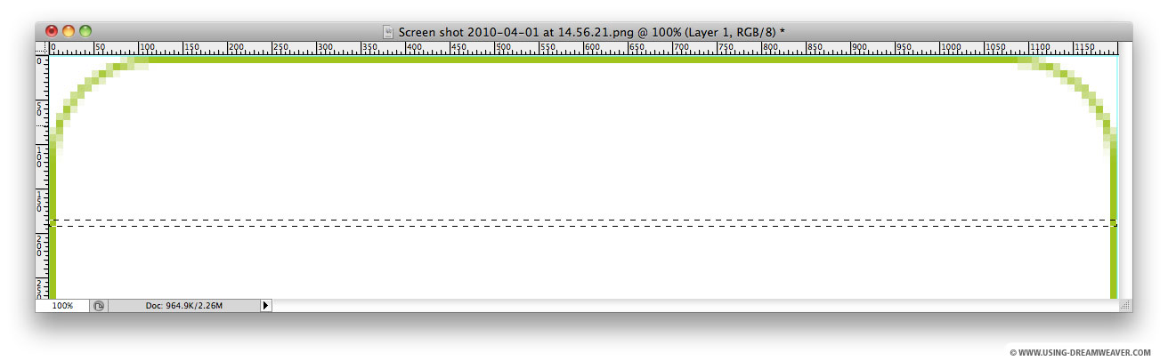
Figure 3
This should leave you with an image 150 pixels wide (or the width of your panel) and 1 pixel high with a single green pixel on the far left and far right, with a row of white pixels in between.
Go to:
File/Save for Web & Devices…
...and save the image as a JPEG High graphic to your site images folder. I called mine left-panel-tile.jpg
Now edit the ud-left-panel DIV tag (currently colored red)
Make sure that you're working in Split View so that you can see both the design and code window panes. In the CSS Styles palette find the DIV called #ud-left-panel (or whatever you named the left column) and double-click it. The should open the CSS Rule Definition editing panel for that DIV.
In the CSS Rule Definition Pane make sure the following settings are applied:
Under Background
Background-color: none (leave blank)
Background-image: images/left-panel-tile.jpg
Background-repeat: repeat-y
Background-position (X): center
Background-position (Y): center
Under Block
Block: inline
Under Box
Width: 150
Float: left
Padding-bottom: 0 pixels
Padding-left: 0 pixels
Margin-bottom: 0 pixels
Margin-left: 60 pixels
The only change here was the removal of the red background and addition of the tiled image which will only be repeated on the Y axis, thus filling the vertical space with a single-width pixel on the left and right, giving the impression of a vertical border (figure 4).
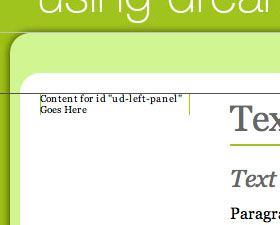
Figure 4
Next create the top corners using an H3 tag
Replace the text currently in the DIV tag: “Content for id "ud-left-panel" Goes Here” with the word: “Heading”. With the text selected in Design View, under the Properties pane select:
Format: Heading 3
The result should look like figure 5 - the standard H3 style which we created earlier.
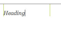
Figure 5
The next thing to do will be to style all occurrences of the H3 tag in the left column, and then create a ‘class’ style which will be applied only to the heading which appears at the top of the panel.
Style the left column H3 tags and create a class style for the top heading
One thing that the Dreamweaver CSS Rule Pane will not let you do is create an ID or Class with a ‘selector’ floating freely at the end of the name, such as: #ud-left-panel h3. You’ll be delivered an error message such as the one in figure 6 if you try.
Instead, you’ll have to either create it as a 'Compound' style (a style made up of a collection of classes and/or IDs), or edit the CSS document directly - I think that this would be a good opportunity to do the latter. Open the CSS file (mine is called using-dreamweaver-styles.css
Find the following code:
#ud-left-panel {
width: 150px;
margin-left: 60px;
float: left;
display: inline;
margin-bottom: 0px;
padding-bottom: 0px;
padding-left: 0px;
background-image: url(images/left-panel-tile.jpg);
background-repeat: repeat-y;
background-position: center center;
}
Underneath the closing ‘}’, paste the following and save the CSS file:
#ud-left-panel h3 {
}
Any style contained within the ‘{‘ and ‘}’ will be applied to any h3 tag appearing in the DIV called #ud-left-panel.
Once done, find the new #ud-left-panel h3 title in the CSS Styles palette and double-click it to open the CSS Rule Definition pane which will now allow you to edit the style.
In the CSS Rule Definition Pane make sure the following settings are applied:
Under Type
Font-size: 1.4 em
Font-style: normal
Font-weight: bold
Color: #666666
Under Box
Padding-top: 10 pixels
Padding-right: 10 pixels
Padding-bottom: 0 pixels
Padding-left: 10 pixels
Margin-top: 0
Margin-bottom: 5
These Type settings make sure that the font appears at approximately 14 point size, is bold (but not italic) and is colored gray. The Box settings give it padded space all around (but zero underneath) and a small bottom margin. The reason we have given it a bottom margin rather than bottom padding is that we want the tiled edges of our round cornered DIV to butt seamlessly up to the bottom of the h3 background image. If we used padding below the heading, it would create a gap.
Add the top heading class style to create the top rounded corners
In the Design View, select the heading text, open the Insert Palette and click ‘Insert Div Tag’. A dialogue box will open, and next to Insert: select ‘Wrap around selection’; then click ‘New CSS Rule’.
Select ‘Class’ as the contextual selector type and call the style: ‘left-panel-top-heading’. Ad it to your existing CSS document using the option at the bottom of the New CSS Rule dialogue.
In the CSS Rule Definition Pane make sure the following settings are applied:
Under Background
Background-image: images/left-panel-top.jpg
Background-repeat: no-repeat
Background-position (X): center
Background-position (Y): top
These settings will ensure that the round-cornered top background image (which we created earlier) will be positioned appropriately behind any element with this class style assigned to it.
Add links to the panel
footNOTE
Menus out of bulleted lists
Probably the best way to create a top and contextual side navigation is by creating a bulleted list and styling the list items with CSS. I'll cover this in a future article, but for the purposes of this website (and in the interests of keeping things simple) I have created the top level and side menus independent of each other.
The purpose of this side panel is to provide the visitor with sub-category navigation, or contextually relevant links. So all it will contain are headings (h3 tags) and lists of links (appearing in this case as ordered lists, <OL>). Create a few sample links by typing in something like the list below. Make the list an ordered list by clicking on the Ordered List icon in the Properties palette:
- Panel Link 1
- Panel Link 2
- Panel Link 3
Now make each item a link by selecting them one at a time and entering a hash tag # into the Link field in the Properties palette.
You should by this time have ended up with something like figure 7.
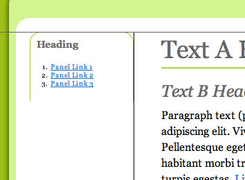
Figure 7
Now we’ll style the list. First we’ll add a style to control the appearance of the OL tag (when it appears in the ud-left-panel) and then we’ll style the links themselves.
Style the panel list
In the CSS Styles palette, right-click (or control click on a Mac) the #ud-left-panel h3 style and select ‘Duplicate’ from the popup menu. In the ‘Duplicate CSS Rule’ dialogue box, leave the Selector Type as ‘Compound (based on your selection)’ and under Selector Name, change the h3 for ol. Click OK.
Two things will happen. First, a new style will appear at the bottom of the CSS Styles palette which you should drag up to position under the ud-left-panel h3 style. Second, the Panel Links list will take on the attributes of the h3 tag, because we told it to - figure 8.
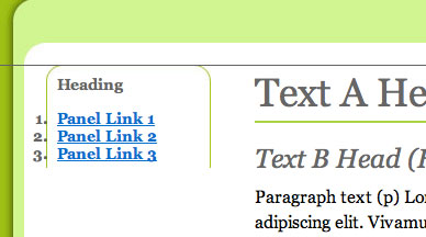
Figure 8
We need to clear all the attributes of the new ud-left-panel ol style and start again. The quickest way to do this is to open the CSS document and edit it directly.
Open your CSS document (mine is called using-dreamweaver-styles.css). Scroll down to where you’ll see:
#ud-left-panel ol {
margin-top: 0px;
padding-top: 10px;
padding-right: 10px;
padding-bottom: 0px;
padding-left: 10px;
margin-bottom: 5px;
font-style: normal;
font-weight: bold;
font-size: 1.4em;
color: #666666;
}
Delete everything contained within the brackets: { } so you end up with:
#ud-left-panel ol {
}
Now save and close the CSS file. You’ll immediately see that the list links have lost their h3 attributes. Now we can start styling them. Double click the ud-left-panel ol style in the CSS Styles palette and enter the following settings:
Under Type
Font-size: 1.2 em
Under Box
Padding-top: 0 pixels
Padding-right: 10 pixels
Padding-bottom: 0 pixels
Padding-left: 25 pixels
Margin: 0 pixels (Same for all)
Under List
List-style-type: disc
List-style-position: outside
These Type settings make sure that the typeface at approximately 12 point size, has right and left padding to keep it lined up with the heading (and to keep it away from edges of the panel). The List settings show bullet points (ordered lists normally show numbers by default) and ensure that the indent created for the bullets is positioned outside the list block, not inside. This prevents any additional margin being applied to the list.
Style the panel list links
To make sure that the links appear in the right color and style, we are going to add link attributes specifically to those links by pasting the following into the style document below the ud-left-panel ol style:
#ud-left-panel a:link {
color: #999999;
}
#ud-left-panel a:visited {
color: #cc99cc;
}
#ud-left-panel a:hover {
color: #000;
}
This will ensure that the links will be gray before clicked, black when hovered over and purple after being visited.
Create the bottom corners using a class style…
In the same way that we created the top corners by assigning a style to a specific element, we’re going to create the bottom corners and base of the panel by adding a ‘class’ style to the final list block, which will display an appropriate background image only when it appears in the Div Tag called ud-left-panel.
So far we’ve been using an OL (ordered list) style within the panel. All we need to do is make sure that the LAST list block that appears has the tag: <ol class="last"> (in Code view) instead of just <ol> (figure 9).
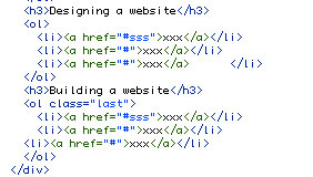
Figure 9
To achieve this, add an additional H3 placeholder subheading and a new list of placeholder links. In the Properties panel, make sure that the list of links is made an Ordered list (figure 10).
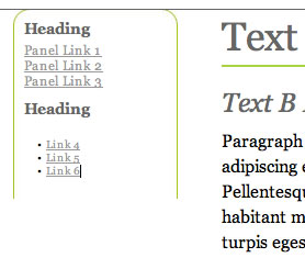
Figure 10
In the CSS document, paste the following beneath the ud-left-panel ol style:
#ud-left-panel ol.last{
}
This is known as a ‘compound’ selector type - in other words, a style made up of two or more existing classes or IDs, which make a more specific, targeted style. After refreshing the CSS Styles palette, this should appear in the list of styles. Double click it to edit it.
In the CSS Rule Definition Pane make sure the following settings are applied:
Under Background
Background-image: images/left-panel-bottom.jpg
Background-repeat: no-repeat
Background-position (X): center
Background-position (Y): bottom
Under Box
Padding-bottom: 10 pixels
These Background settings place the bottom rounded corners below and behind the list block, whilst the Box settings give it padded space at the bottom. If any settings are left blank, they will be ‘inherited’ from the broader #ud-left-panel ol style above.
We should now have a perfectly formed round cornered panel (figure 11).
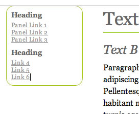
Figure 11
As I mentioned earlier, there is more than one way to create rounded corners on DIV tags, and the method you choose will depend on context, functionality and browser compatibility. Next is a variation on the above method which I'll use to create the side panels which appear on the right of this website.
Create Round Cornered DIV Tags#1 - End of Article
Go to previous article | Go to Home Page | Go to next article
Feedback required!
Please send any questions or feedback to: feedback@using-dreamweaver.com or leave it on our Facebook page.